Signs of Svalbard
Information stations with a clear identity
The ambition has been to develop Longyearbyen as an adventure arena for both visiting tourists and residents. The information stations contribute to destination awareness and will offer knowledge about Svalbard's natural and cultural history, environmental regulations as well as urban experiences and attractions.
LINK Arkitektur has been responsible for the architectural content for the new information boards in Longyearbyen on Svalbard and has worked as a subcontractor to Tibe-T, Advertising agency. The clients were visit Svalbard, the Governor of Svalbard, and the Longyearbyen local council.
The sign stations consist of seven platforms with a holistic connection, and are strategically positioned to form a short, medium, and long town walk. The stations are located along the town walk in Longyearbyen inviting people to the area and creating a greater interest in Svalbard's unique history.
The idea is based on "what is below, and what is above", in the sense of "what we cannot see, and what we can see". What we can't see is the permafrost, which is underground and has an upper layer that follows the seasons, and what we can see are all the buildings above the ground standing on stilts because the ground is constantly moving. These characteristics are reflected in the signs' installation platforms, shaped to give the impression of coming out of the ground. While the narrow information columns on top of the platforms reflect the piles on which the entire city is built.
The contents on the signposts depict the special Arctic nature, the history of the city, and the people who created it. The signs’ have been shaped to blend in with the surroundings with a sober, timeless, and elegant design, whilst arousing curiosity and interest. The motifs are exposed differently from different angles - and symbolize what you see and what you do not see.
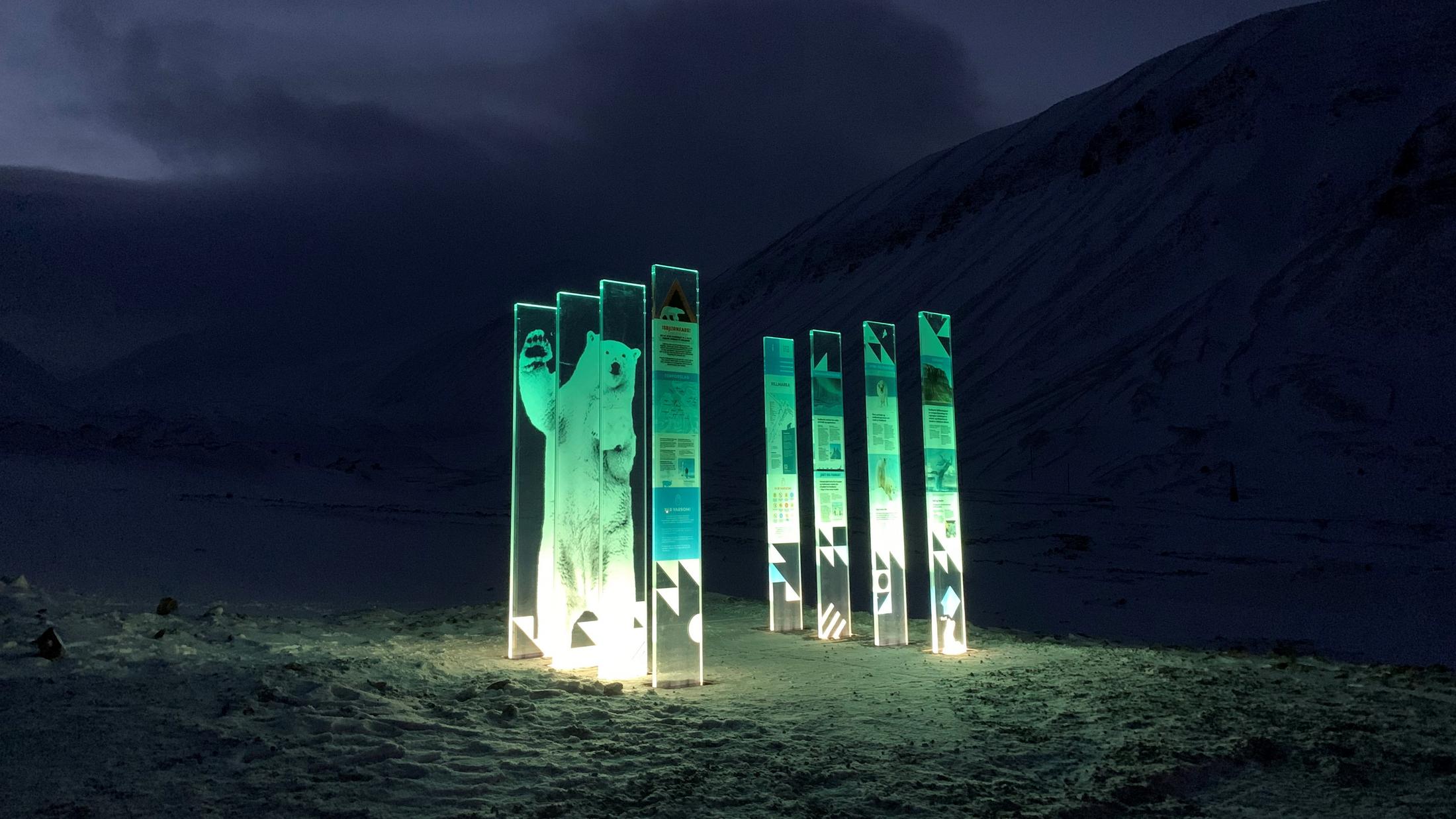
The information signs are made of glass, partially transparent with a tall and slim shape. The sign bases are illuminated in colours adapted to the distinctive light special to Svalbard and in Longyearbyen. The glass is printed with text and motifs of Arctic wildlife, with a light expression in white, green, and blue that harmonizes with the surrounding nature on Svalbard.
The project is funded through public value-added funds, earmarked for projects that contribute to the development of attractions for tourism as well as the facilitation and dissemination of cultural monuments.
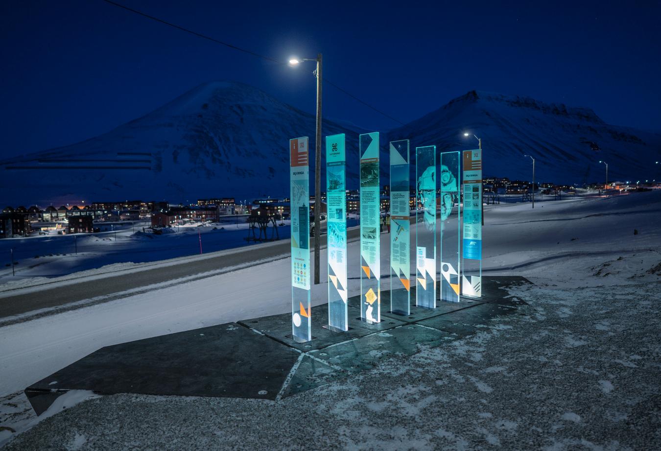
The stations are located along the town walk in Longyearbyen inviting people to the area and creating a greater interest in Svalbard's unique history. Photo: Tommy Dahl Markussen
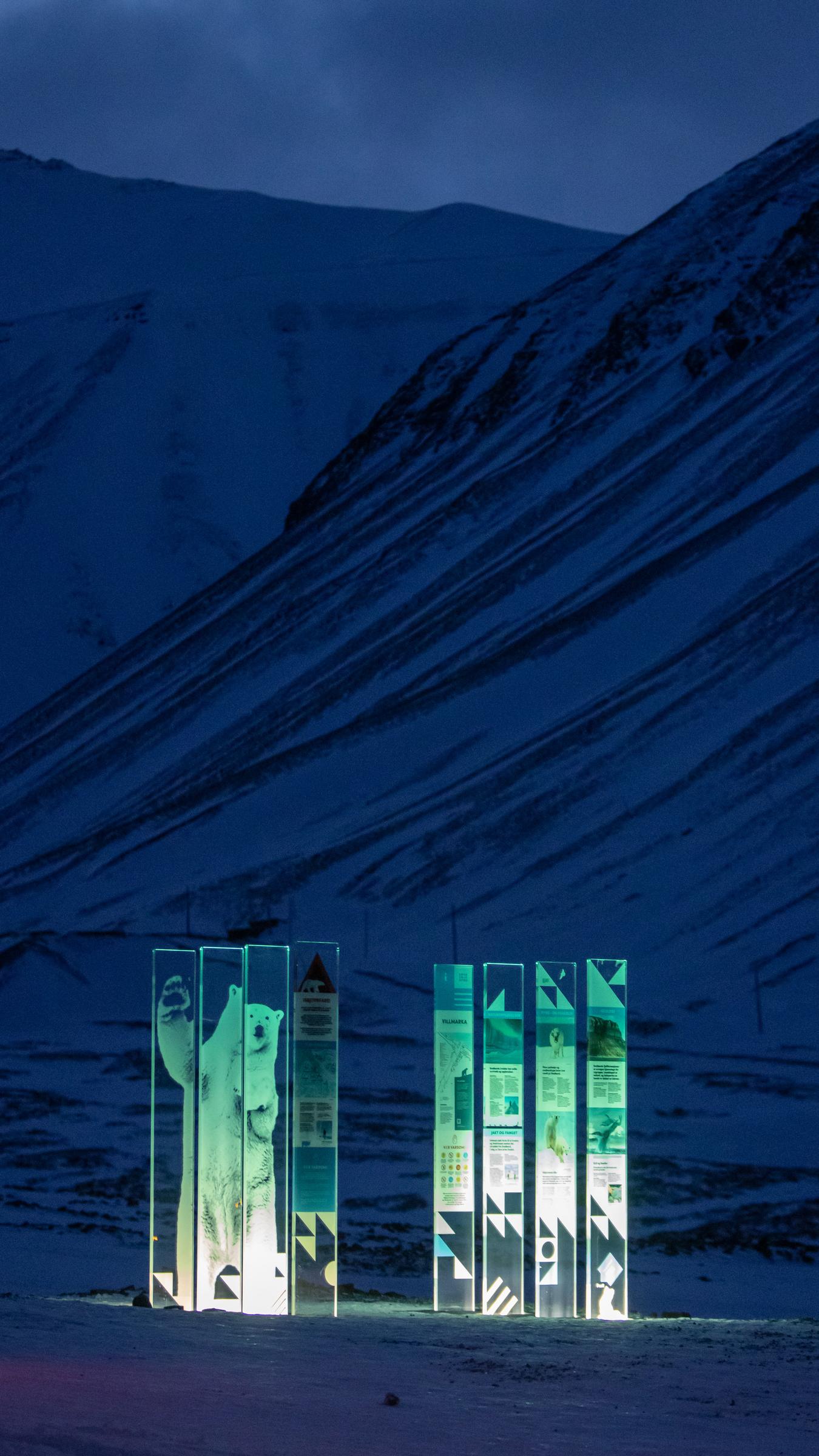
The information signs are made of glass, partially transparent with a tall and slim shape. The sign bases are illuminated in colours adapted to the distinctive light special to Svalbard and in Longyearbyen. Photo: Tommy Dahl Markussen
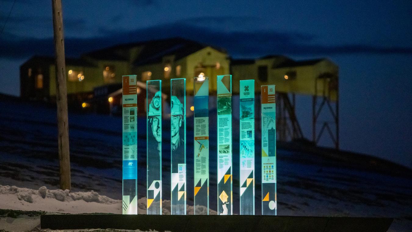
The contents on the signposts depict the special Arctic nature, the history of the city, and the people who created it. Photo: Tommy Dahl Markussen
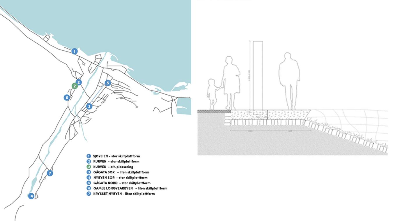
The sign stations consist of seven platforms that have a well-thought-out and holistic connection and are strategically positioned to form a short, medium, and long town walk. Illustrasjons: LINK Arkitektur.
