LINK’s Gothenburg office
A collaboration hub focusing on aesthetics and reuse
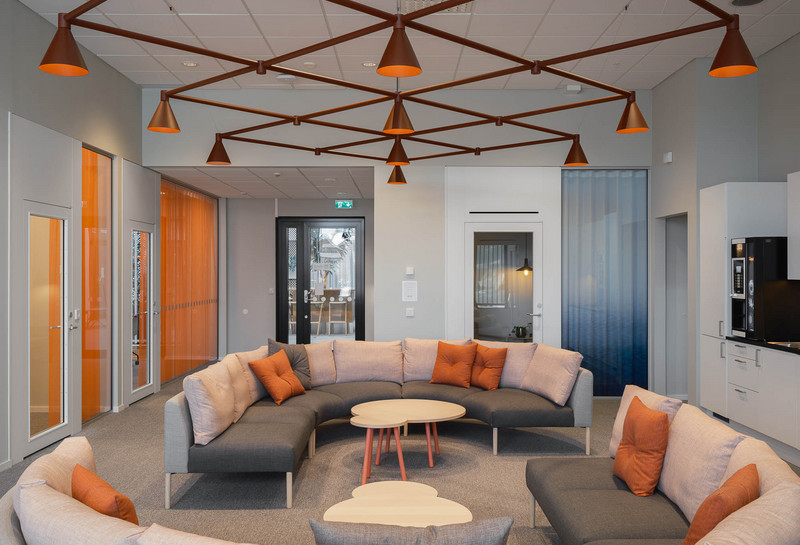
When our Gothenburg office needed to move, our aim was clear: we wanted it to be a hub for collaboration with a high level of design expertise, as much reuse as possible and a strong visual identity.

The design is based on the building itself and references the rusty colours and rounded corners of the 1940s. The interior designers rebuilt the offices, created flexibility and ensured as much reuse as possible to keep costs and environmental impact down. Aesthetics and sustainability are a common thread throughout the project. Success on this renovation project depended on a strong concept. Part of the solution to achieve a high level of aesthetic quality was to work with reuse.


